KLARNA
Shopping Feed:
Shopping Feed:
Commerce Discovery Platform Redesign
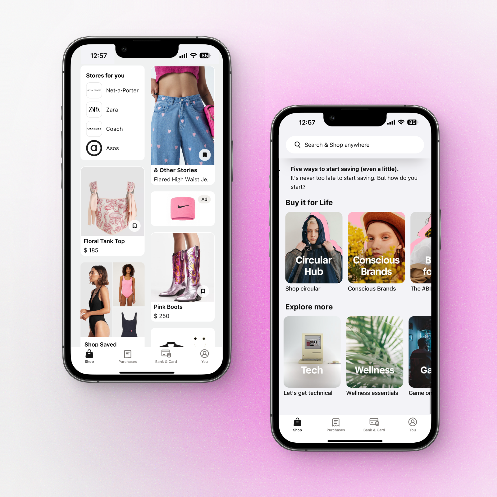
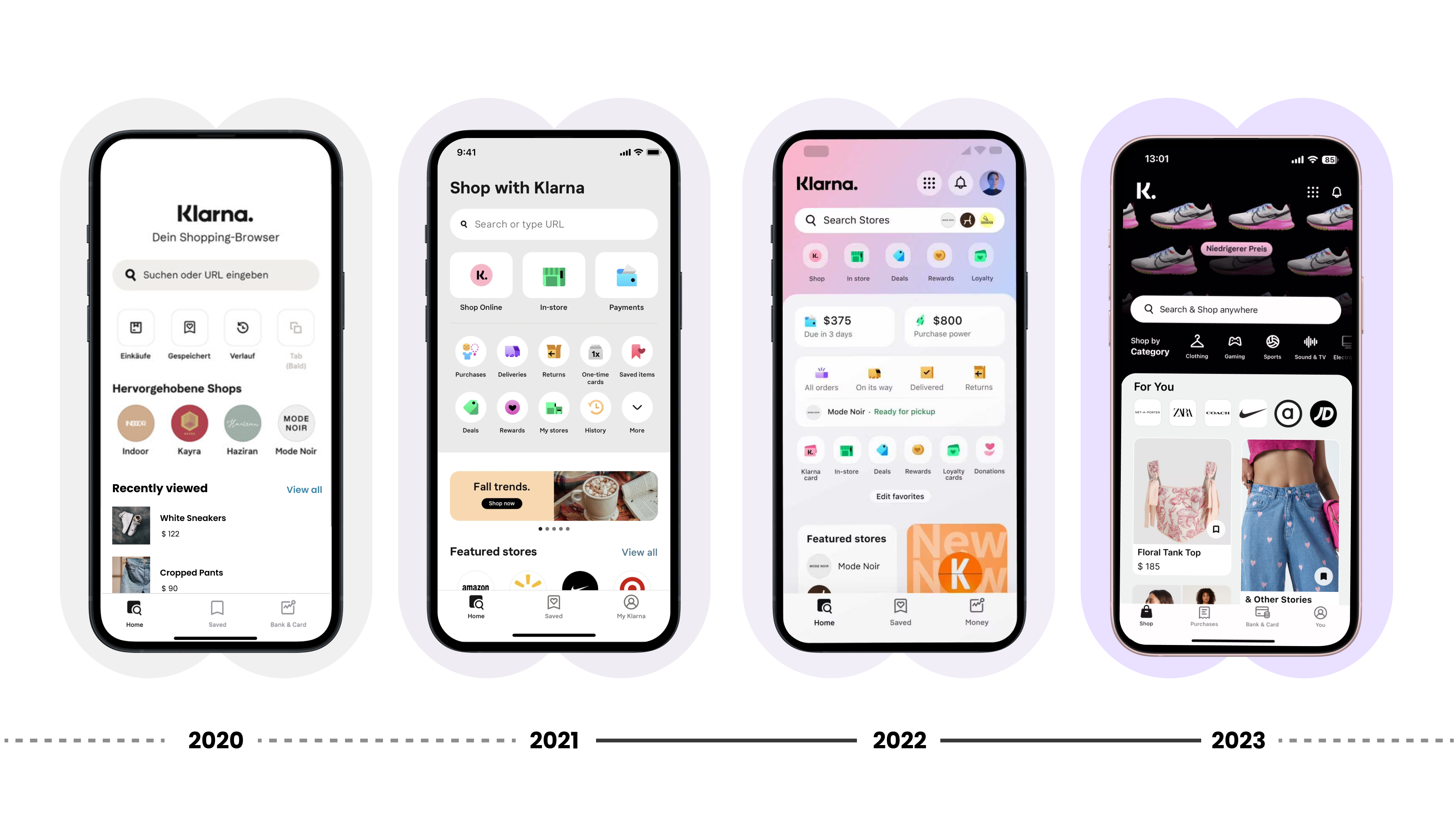
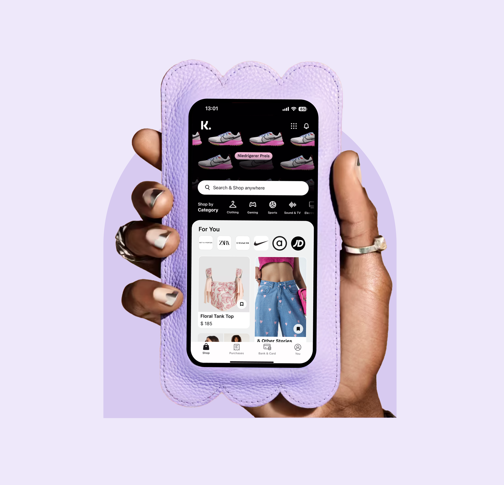
Redesigned Klarna's app home for 150M users — from a transactional screen to a personalised shopping discovery feed. Led design strategy, research, and delivery across 16 cross-functional teams, driving 60% higher average viewing time and 25% higher CTR.
Statement
Klarna's company OKRs called for growing the active customer base, increasing shopping volume per user, and strengthening engagement and retention.
Goal
Increase customer satisfaction and trust. Create a habit of using Klarna for shopping. Streamline the decision-making process for Klarna's 150 million active users to align with the company's objectives and key results.
Increase customer satisfaction and trust. Create a habit of using Klarna for shopping. Streamline the decision-making process for Klarna's 150 million active users to align with the company's objectives and key results.
Role
Lead Product Designer
Lead Product Designer
Responsibilities
I was responsible for design strategy, content and personalisation strategy, hands-on design and prototyping, user research, testing and analysis, cross-functional alignment, designer mentoring, and overseeing launch preparation.
I was responsible for design strategy, content and personalisation strategy, hands-on design and prototyping, user research, testing and analysis, cross-functional alignment, designer mentoring, and overseeing launch preparation.
1.
INTRODUCTION
KLARNA BANK AB
Commonly referred to as Klarna is a Swedish fintech company that provides online financial services such as payments for online storefronts and direct payments along with post-purchase payments.
• Customers: 150M users, 500K Merchants.
• More than 5,000 employees, most of them working at the headquarters in Stockholm and Berlin.
• In 2021, the company handled about US$80 billion in online sales.
• As of 2011, about 40% of all e-commerce sales in Sweden went through Klarna.
• In 2021, the company was Europe's most valuable private tech company, at a $45.6 billion valuation.
• More than 5,000 employees, most of them working at the headquarters in Stockholm and Berlin.
• In 2021, the company handled about US$80 billion in online sales.
• As of 2011, about 40% of all e-commerce sales in Sweden went through Klarna.
• In 2021, the company was Europe's most valuable private tech company, at a $45.6 billion valuation.
Klarna's core service is to provide payment processing services for the e-commerce industry, managing store claims and customer payments. It has become known as a "Buy now, pay later" (BNPL) service provider, offering customers credit on their purchases as part of the checkout process.
Team
The core team was a cross-functional squad: Product Manager (only the first month), Product Designer, 4 Engineers, and a Data Analyst. Specialist competencies (User Research, Motion Design, Content Design) were brought in on demand.
Timeline
The project ran from late 2021 through an official launch in early 2023. I was involved from the first user interviews through final solution testing and handoff to development.
Shopping FEED
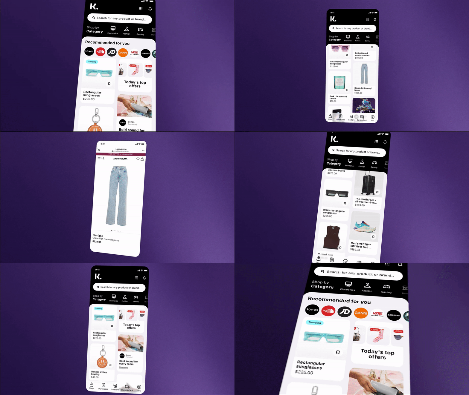
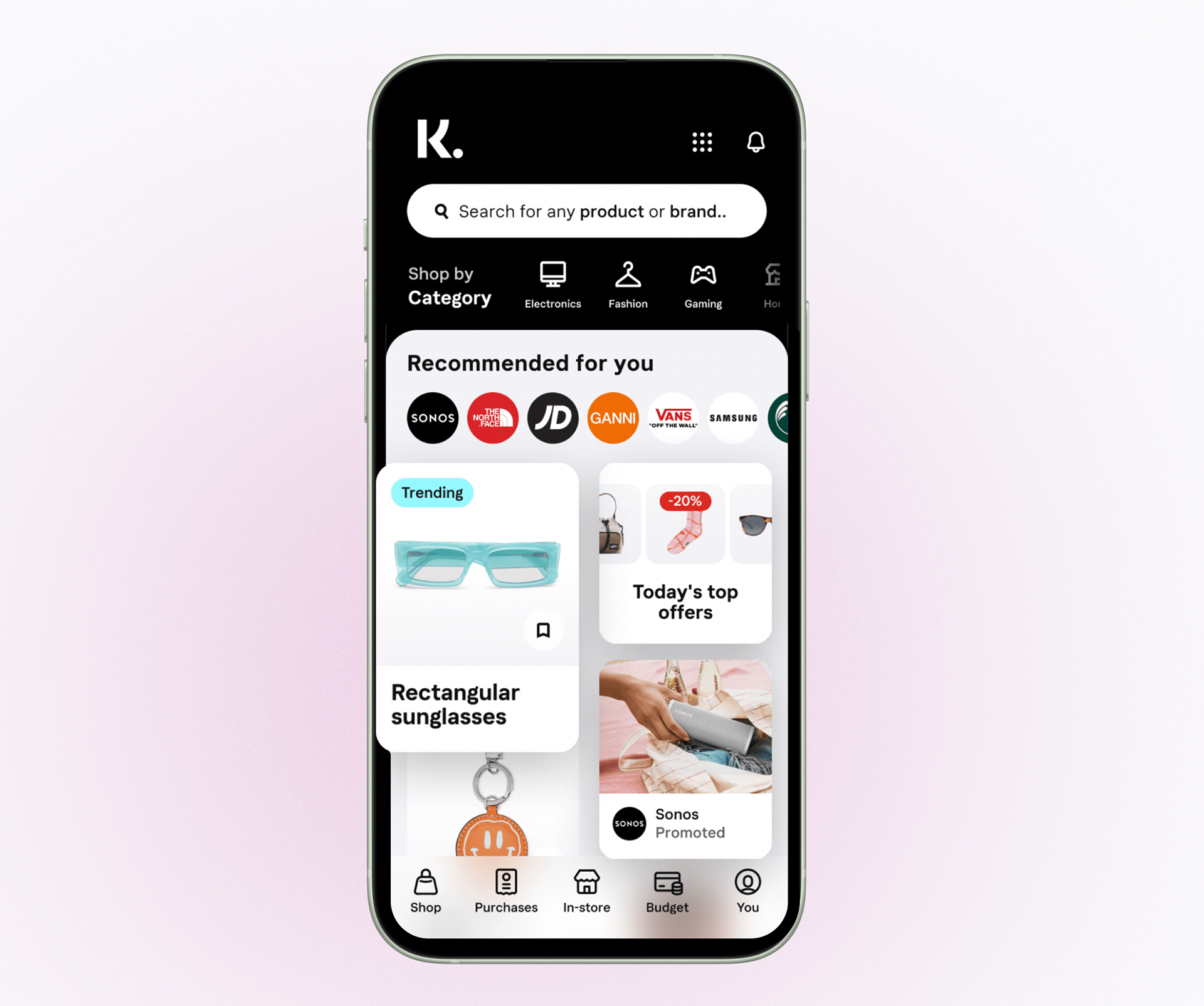
Klarna's Shopping Feed is the discovery surface at the heart of the app, a curated stream of fashion, beauty, home, and lifestyle products shoppable directly through Klarna's buy now, pay later service.
Editorially shaped by Klarna's trend team and spanning established brands to emerging designers, the feed is designed to move users beyond search-led shopping, surfacing products they didn't know they were looking for, in a format that makes discovery and purchase feel seamless.
Editorially shaped by Klarna's trend team and spanning established brands to emerging designers, the feed is designed to move users beyond search-led shopping, surfacing products they didn't know they were looking for, in a format that makes discovery and purchase feel seamless.
Challenge
Relevance vs. serendipity.
A feed that only reinforces existing preferences creates a filter bubble. The design challenge was building a personalisation system that felt tailored without becoming predictable, introducing users to genuinely new products while maintaining trust in the recommendations.
Engagement and trust.
Recommendations only work if users believe in them. Establishing that credibility — through accuracy, transparency, and interface signals — was as much a design problem as an algorithmic one.
Competitive pressure.
In a crowded e-commerce landscape, recommendation quality is a direct differentiator. The feed needed to match or exceed what users experienced elsewhere, while delivering something distinctly Klarna.
A feed that only reinforces existing preferences creates a filter bubble. The design challenge was building a personalisation system that felt tailored without becoming predictable, introducing users to genuinely new products while maintaining trust in the recommendations.
Engagement and trust.
Recommendations only work if users believe in them. Establishing that credibility — through accuracy, transparency, and interface signals — was as much a design problem as an algorithmic one.
Competitive pressure.
In a crowded e-commerce landscape, recommendation quality is a direct differentiator. The feed needed to match or exceed what users experienced elsewhere, while delivering something distinctly Klarna.
User control.
Personalisation must feel empowering, not imposed. Users needed clear ways to shape their experience — without that friction becoming a barrier to engagement.
Accessibility.
As a licensed bank, Klarna holds itself to a high compliance standard. WCAG conformance wasn't a checkbox; it was a core design constraint applied throughout..
As a licensed bank, Klarna holds itself to a high compliance standard. WCAG conformance wasn't a checkbox; it was a core design constraint applied throughout..
2.
DISCOVERY
AND RESEARCH
AND RESEARCH
REVIEWING
EXTERNAL SOLUTION
EXTERNAL SOLUTION
Is a critical step in the product design process as it allows for iterative improvement, validation of goals, identification of technical considerations, and the creation of user-centric and innovative designs. It ensures that the final product meets the needs of both the users and the business. It helped me to identify the next issues:
• Not solving user problems
• Breaks successful flows
• Not accessible
• Not aligned with the design system
assessment
Working on an assessment of the solution that the team started to build I decided to design an alternative solution based on discovery and user needs. Initial steps that I took
competitor
Analysis
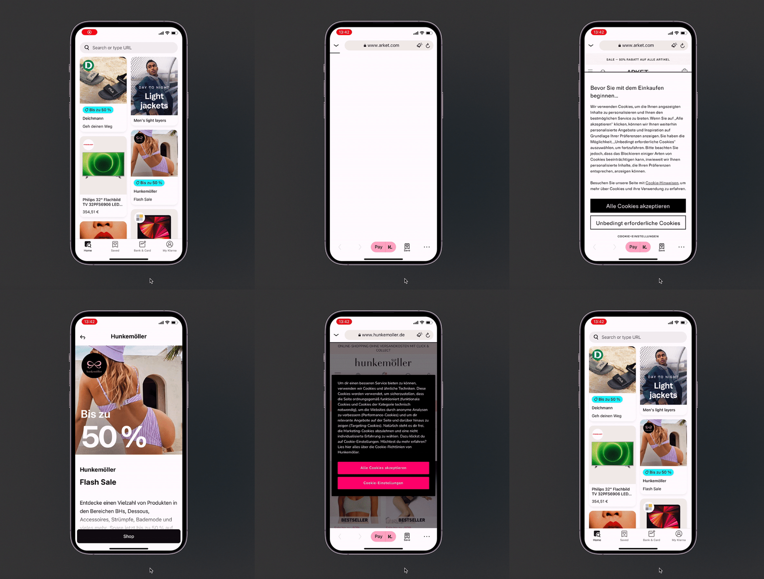
I reviewed 8 different products with solutions similar to those proposed. It showed that none of them succeeded. The biggest one was acquired by Zalando (one of Europe's biggest e-commerce) but shortly they also took it down.
Working on an assessment of the solution that the team started to build I decided to design an alternative solution based on discovery and user needs. Initial steps that I took
competitor
Analysis
I reviewed 8 different products with solutions similar to those proposed. It showed that none of them succeeded. The biggest one was acquired by Zalando (one of Europe's biggest e-commerce) but shortly they also took it down.
User
Journey
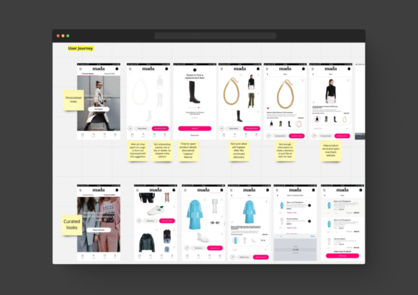
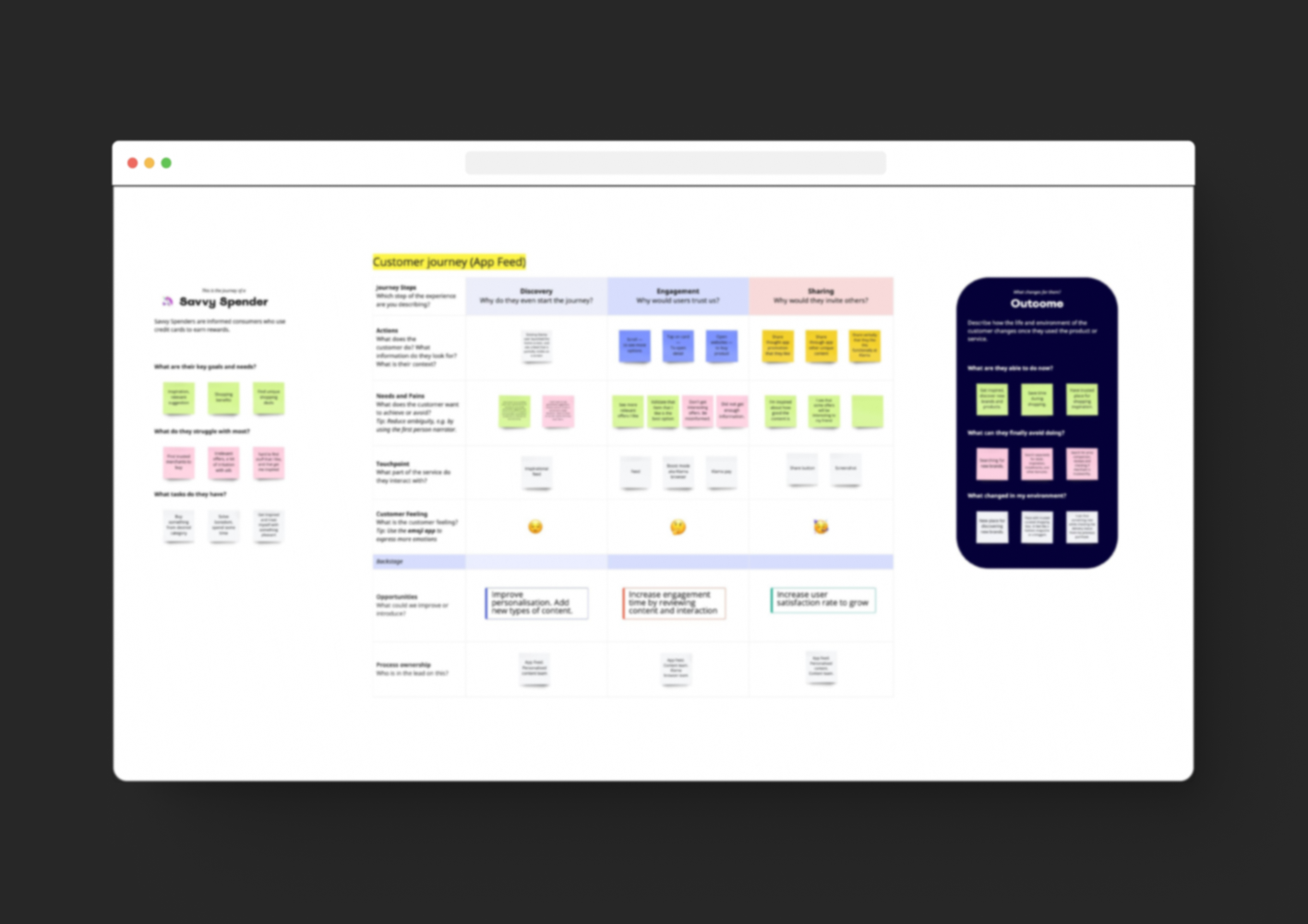
Journey mapping surfaced three consistent friction points: lack of personalisation, inconsistent card behaviour across the feed, and slow decision-making. These became the north star for everything that followed.
Journey
Journey mapping surfaced three consistent friction points: lack of personalisation, inconsistent card behaviour across the feed, and slow decision-making. These became the north star for everything that followed.
Online Shoppers Problems
• Lack of personalization
• Inconsistent UX
• Time-consuming decision-making
What influences "Buy Now Pay Later" users
• Lowest price
• Sale, Discount, Promo
• Customer reviews
Identifying
Key Challenges
Key Challenges
Lack of personalization
Customers want a shopping experience tailored to their specific needs and preferences.
Customers want a shopping experience tailored to their specific needs and preferences.
Inconsistent user experience
The same-looking cards act differently. This leads to customer frustration and dissatisfaction and can result in lost sales.
Decision-making
Which can be time-consuming for online shoppers. For some, it can be a reason to drop from the current user's journey.
Which can be time-consuming for online shoppers. For some, it can be a reason to drop from the current user's journey.
70% of consumers would prefer to have one single app that incorporates all the features of the shopping apps they currently use.
* The survey was conducted in collaboration with the research agency Dynata in October 2021 and surveyed 13,594 consumers across 13 countries; US, UK, Australia, Belgium, Finland, France, Netherlands, Norway, Sweden, Italy, Spain, Germany, and Austria.
3.
DEVELOPING
SOLUTION
SOLUTION
Design Strategy
Based on the conducted discovery, collected data, and analyzed user interviewers I identified the next opportunities to improve user experience and meet business needs:
• Personalisation
• Easier decision-making
• New engaging content
• Consistent and enjoyable UX
• Feed as a Shopping entry point
Based on the conducted discovery, collected data, and analyzed user interviewers I identified the next opportunities to improve user experience and meet business needs:
• Personalisation
• Easier decision-making
• New engaging content
• Consistent and enjoyable UX
• Feed as a Shopping entry point
Feed Layout
Options
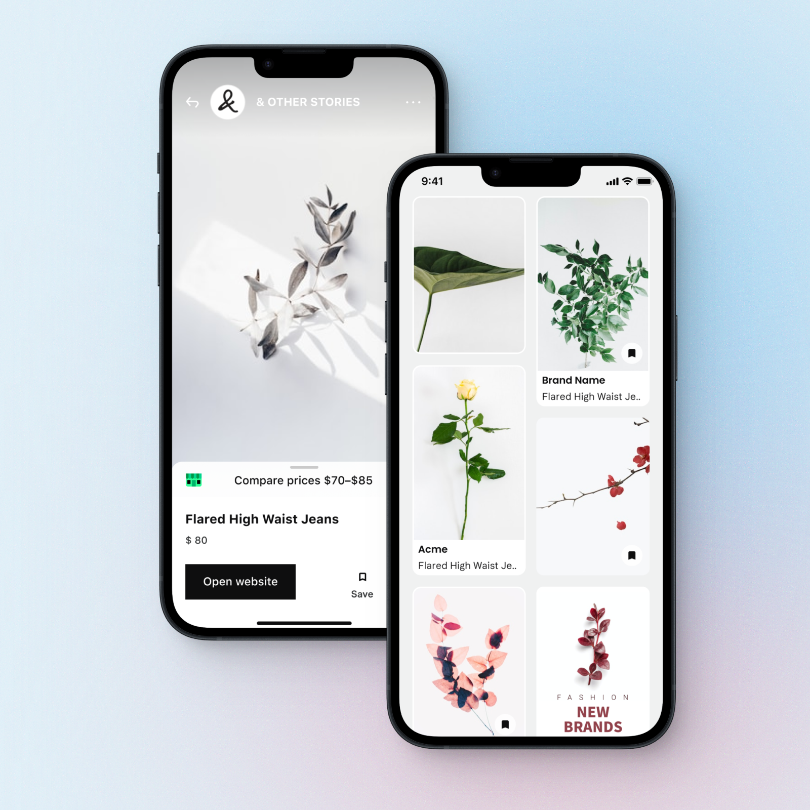
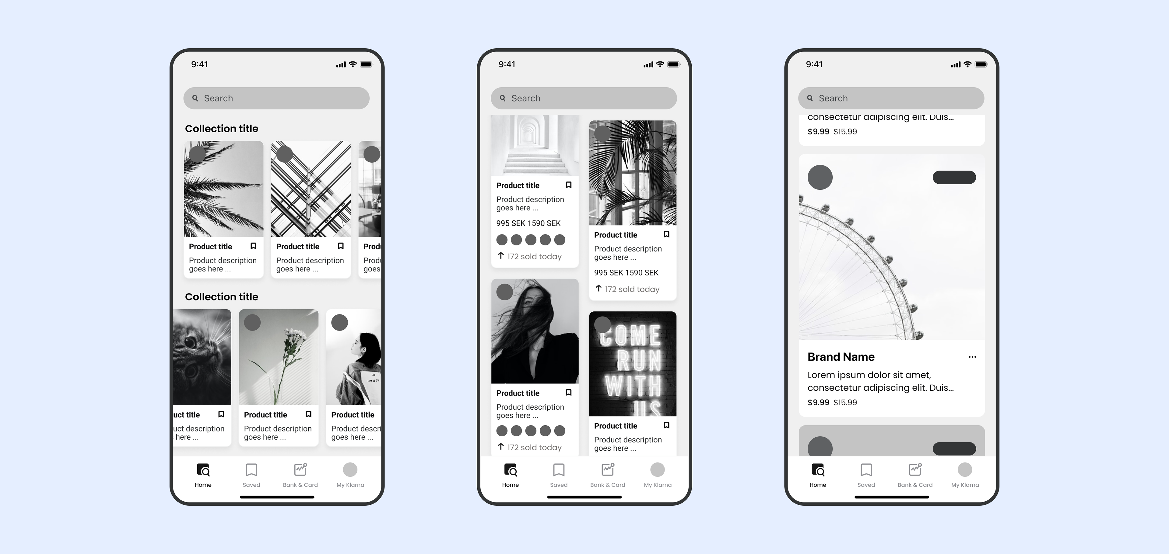
Data has shown that between those options with a KPI "item seen per session" the grid layout performs significantly better.
Options
Data has shown that between those options with a KPI "item seen per session" the grid layout performs significantly better.
Card
Progression
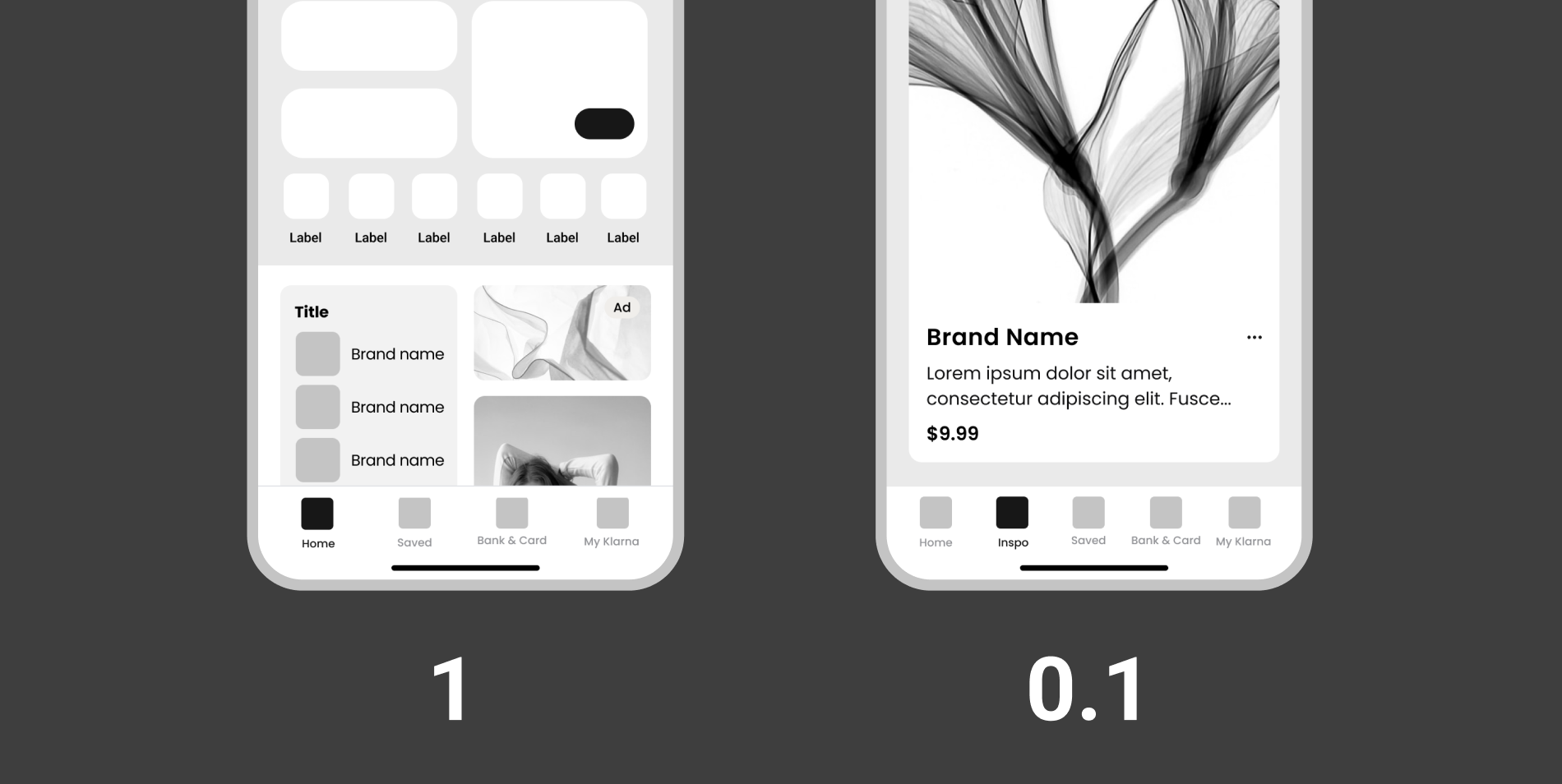
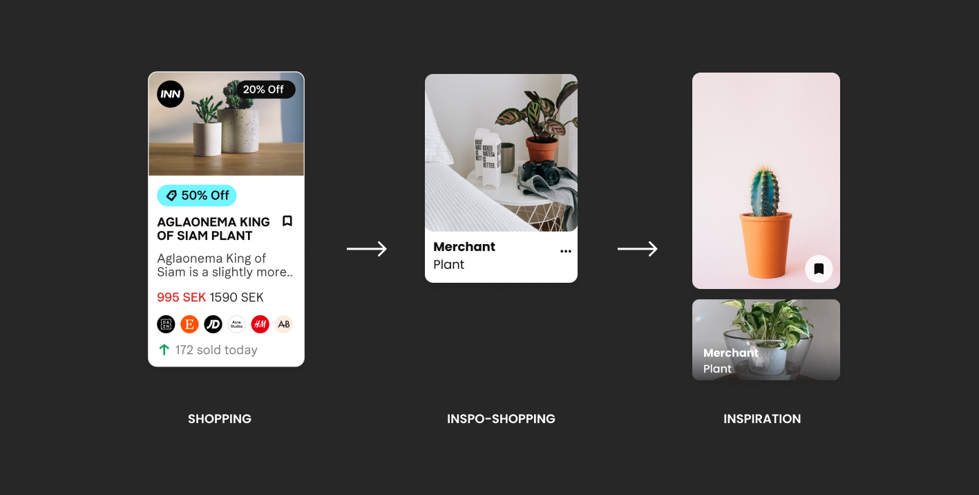
By changing the product card itself, we can change focus from shopping to inspiration with minimal development effort.
Progression
By changing the product card itself, we can change focus from shopping to inspiration with minimal development effort.
Feed Look'n'Feel
Evolution
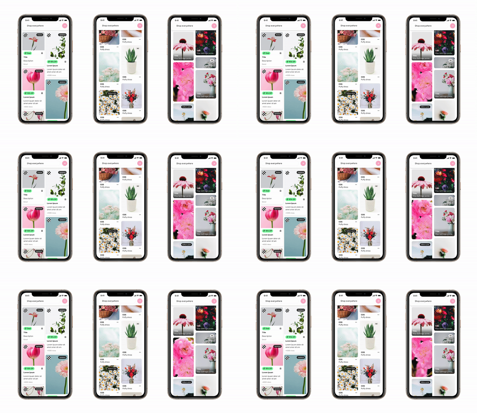
Based on goals — Shopping, Inspo-Shopping or Inspiration, and card design we can achieve different-looking feeds.
Evolution
Based on goals — Shopping, Inspo-Shopping or Inspiration, and card design we can achieve different-looking feeds.
4.
User Testing
Validation
Validation
Prototypes
I built Figma prototypes using both male- and female-presenting content to reduce bias in test sessions and keep feedback focused on the interaction design rather than the imagery.
Focus on Content
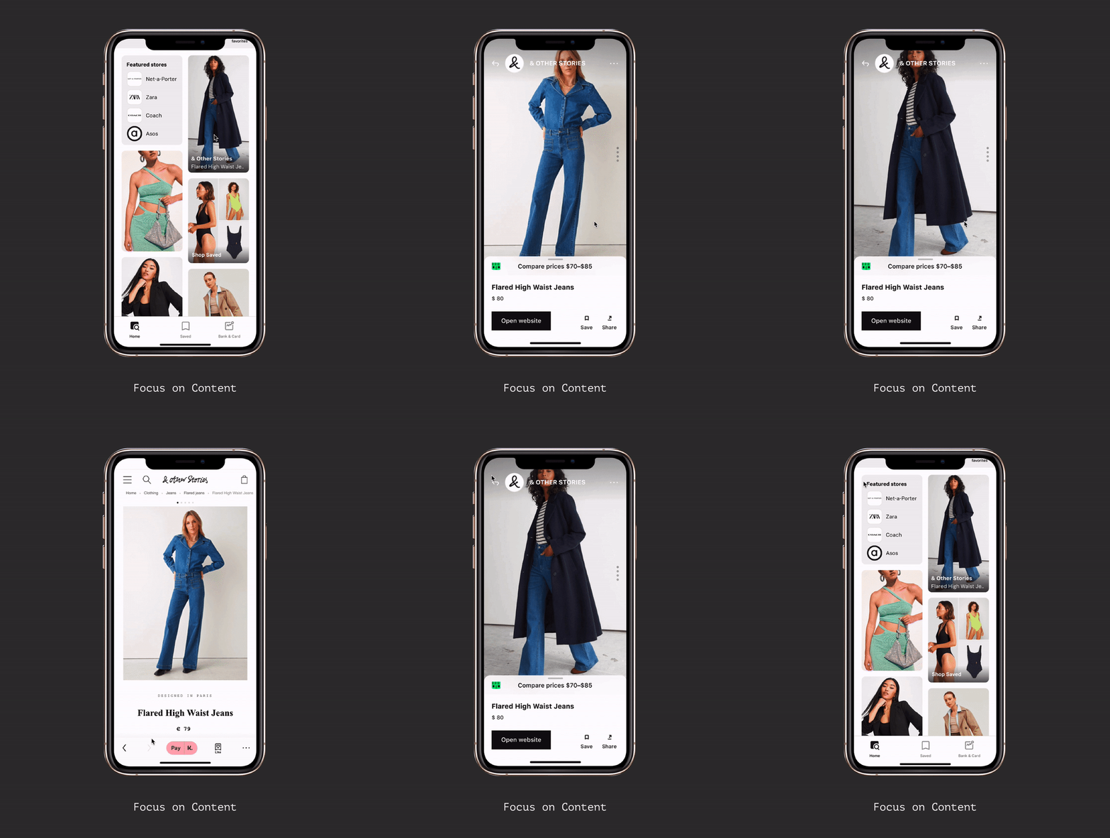
Focusing on content, particularly larger and more images, benefits online shoppers by providing a visual representation of products, aiding product understanding and evaluation, building trust, simulating the in-store experience, and reducing uncertainty and returns.
By enhancing the visual content, we can improve the online shopping experience and assist users in making confident and informed purchasing decisions.
I built Figma prototypes using both male- and female-presenting content to reduce bias in test sessions and keep feedback focused on the interaction design rather than the imagery.
Focus on Content
Focusing on content, particularly larger and more images, benefits online shoppers by providing a visual representation of products, aiding product understanding and evaluation, building trust, simulating the in-store experience, and reducing uncertainty and returns.
By enhancing the visual content, we can improve the online shopping experience and assist users in making confident and informed purchasing decisions.
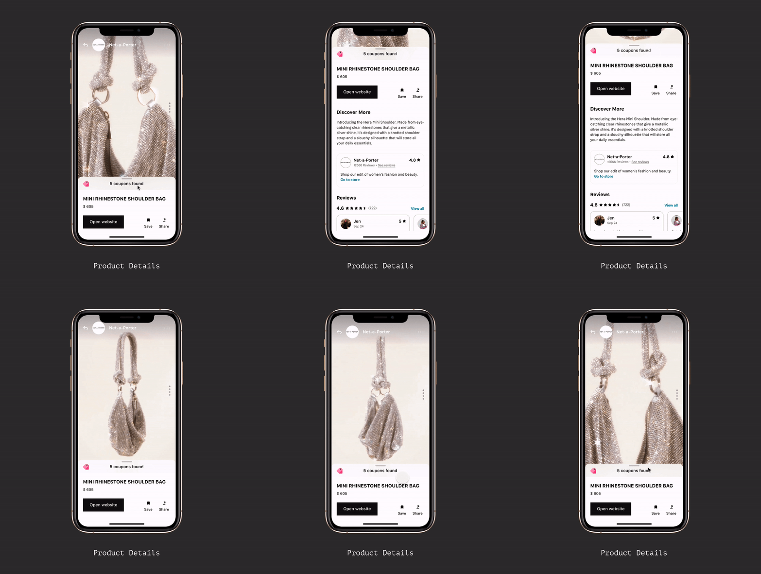
Product Details
• Price Comparison and Coupons
• Reviews
• Products suggestions
By providing detailed information, product details empower users to make informed decisions based on their unique requirements, preferences, and priorities. They enhance transparency, trust, and user satisfaction, enabling users to select products that best meet their needs.
Product details play a crucial role in helping users make informed decisions. They provide users with the necessary information to evaluate and compare products based on their specific needs and preferences. Here are product details that I included in the concept to assist users in decision-making:
• Product Description• Price Comparison and Coupons
• Reviews
• Products suggestions
By providing detailed information, product details empower users to make informed decisions based on their unique requirements, preferences, and priorities. They enhance transparency, trust, and user satisfaction, enabling users to select products that best meet their needs.
Product Details
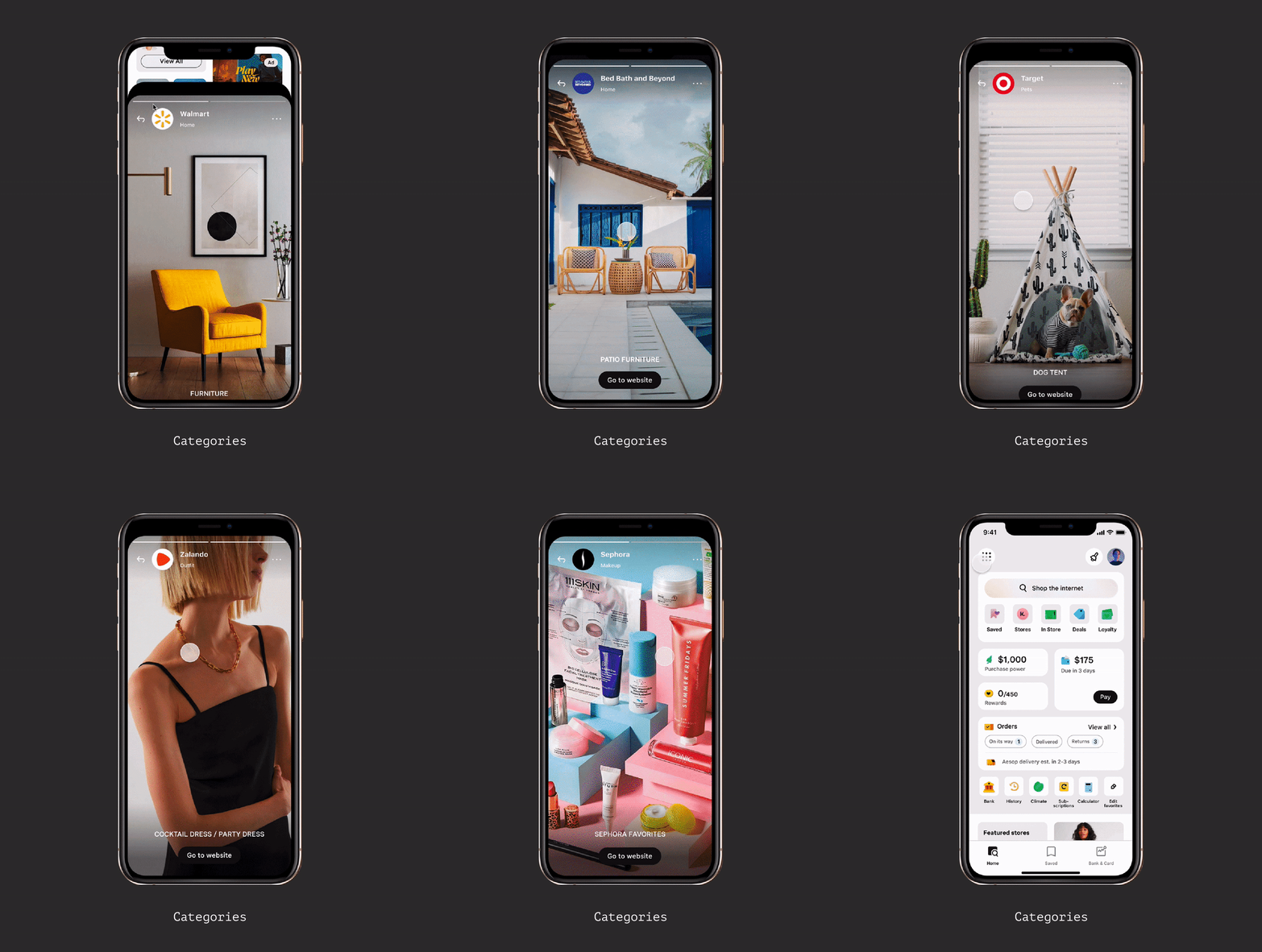
Personalized categories
Categories of content play a significant role in inspiring users during the online shopping experience.
By offering diverse categories of content, we can provide users with a wealth of inspiration and ideas. Users can explore featured products, personalized recommendations, trending items, lookbooks, user-generated content, and seasonal collections to discover new products, explore different styles, and find inspiration for their shopping endeavors.
Categories of content play a significant role in inspiring users during the online shopping experience.
By offering diverse categories of content, we can provide users with a wealth of inspiration and ideas. Users can explore featured products, personalized recommendations, trending items, lookbooks, user-generated content, and seasonal collections to discover new products, explore different styles, and find inspiration for their shopping endeavors.
Iterations
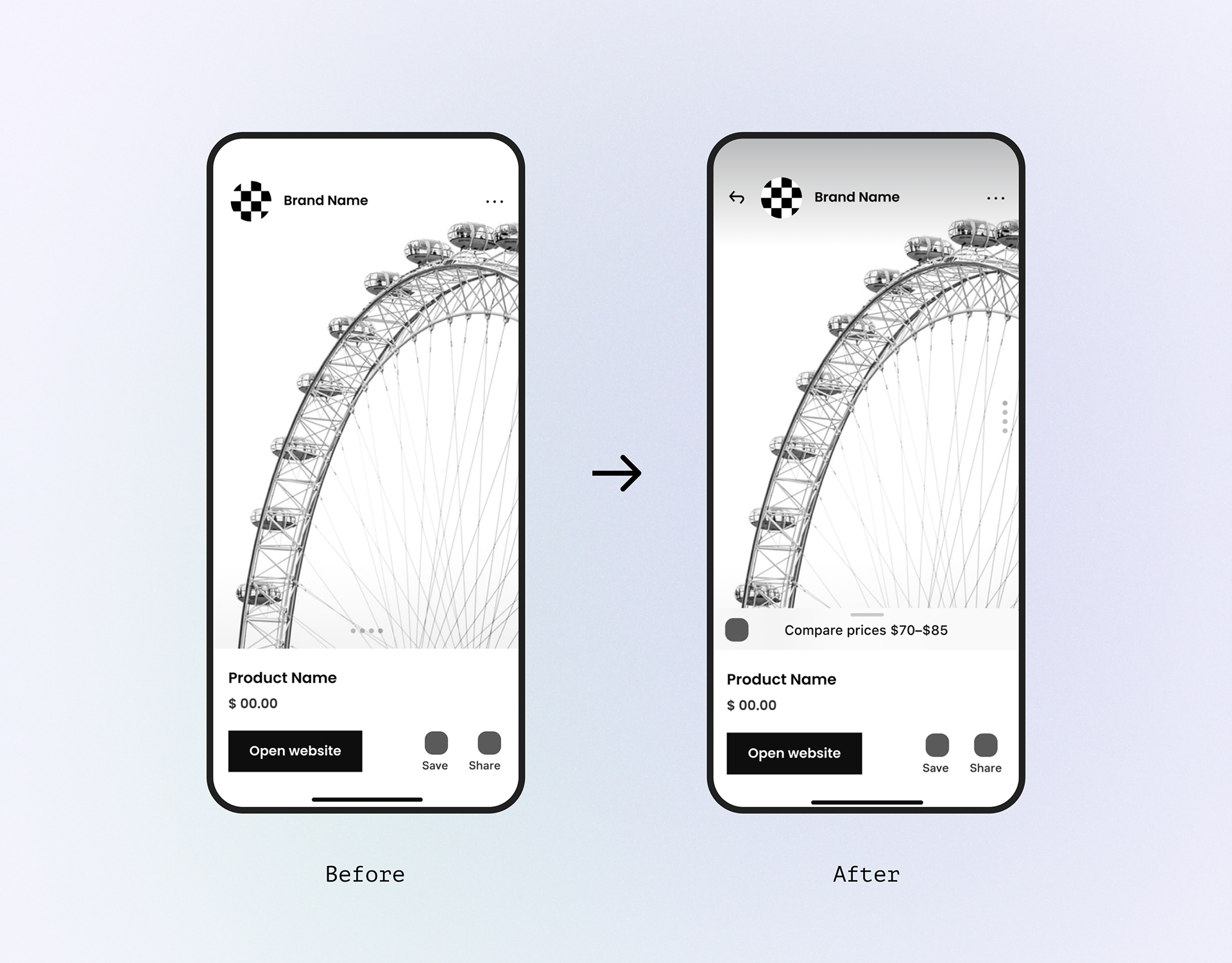
User testing provided valuable feedback on the design decisions made during the prototyping phase. This feedback helped to validate and invalidate these decisions and make necessary adjustments in subsequent iterations.
By iterating on the prototype based on user feedback, the product becomes more appealing and relevant to the target audience. This leads to higher user adoption and a more successful product launch.
User testing provided valuable feedback on the design decisions made during the prototyping phase. This feedback helped to validate and invalidate these decisions and make necessary adjustments in subsequent iterations.
By iterating on the prototype based on user feedback, the product becomes more appealing and relevant to the target audience. This leads to higher user adoption and a more successful product launch.
User
Testing
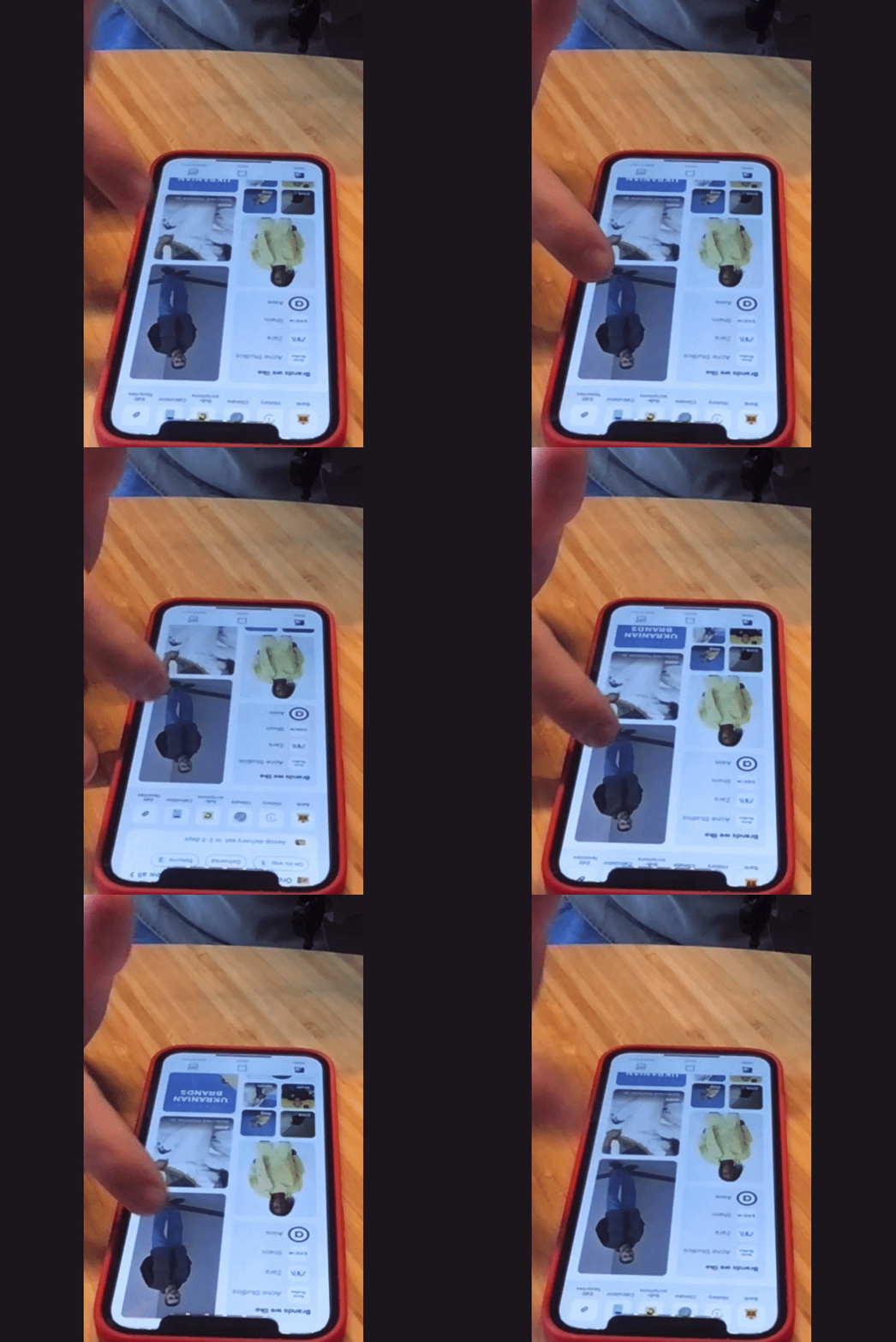
The process of testing the prototype involved two stages. The first stage involved internal testing, where the prototype was tried by the company's employees. This stage helped to identify any potential flaws or issues that needed to be addressed before external customers tested the prototype.
Testing
The process of testing the prototype involved two stages. The first stage involved internal testing, where the prototype was tried by the company's employees. This stage helped to identify any potential flaws or issues that needed to be addressed before external customers tested the prototype.
The second stage involved testing the prototype with a selected customer group in the United States. This was done to gather valuable feedback from a representative sample of the target market and to see how the product performed in real-world conditions.
The results of this testing helped to make any necessary improvements to the prototype and to fine-tune it to meet the needs of customers better.
User
Feedback
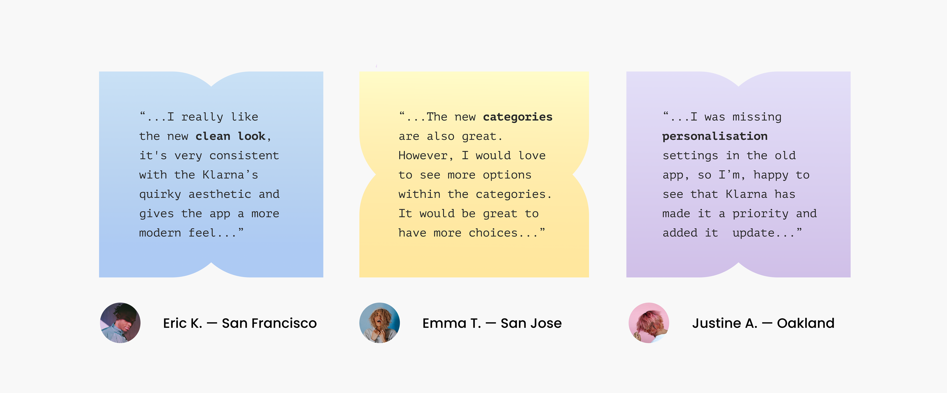
The feedback we receive during test sessions is invaluable in shaping our feed. And help validate the hypothesis: Personalisation is crucial; People shop in categories; Importance of variety of content; Consistent interactions are important.
Feedback
The feedback we receive during test sessions is invaluable in shaping our feed. And help validate the hypothesis: Personalisation is crucial; People shop in categories; Importance of variety of content; Consistent interactions are important.
5.
COLLABORATION
AND ALIGNMENT
AND ALIGNMENT
Driving
Collaboration
Collaboration
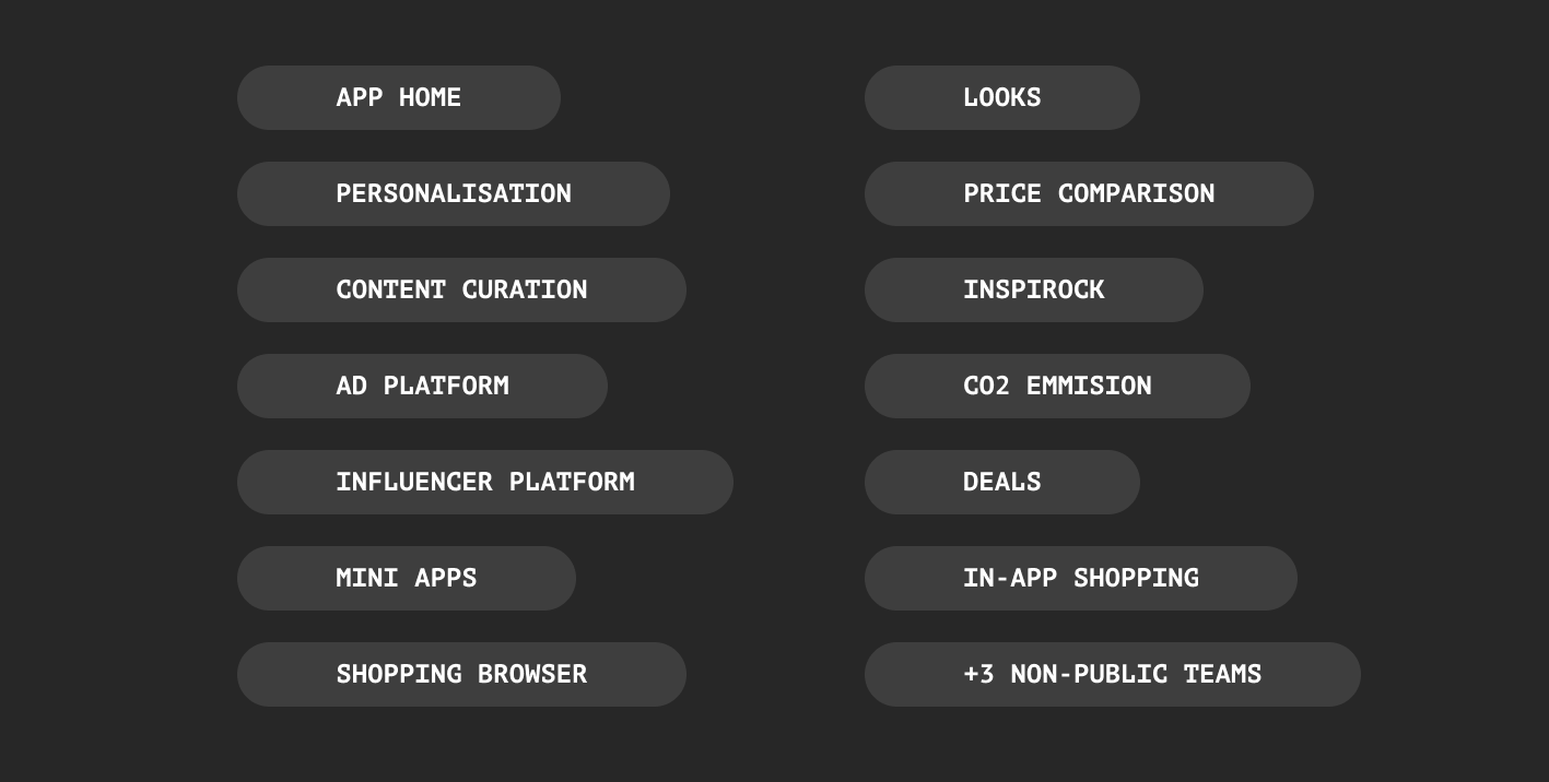
Our home page is a highly visible location, and various teams are keen on having their content featured there. Therefore, I took on the task of bringing together 16 teams that were responsible for creating content for our feed.
Workshops
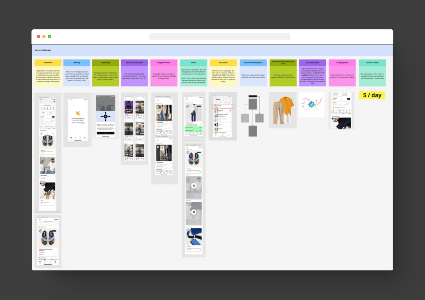
To keep 16 teams moving in the same direction, I set design OKRs for the initiative and ran a recurring review cadence, giving teams a shared definition of success rather than relying on ad hoc alignment.
6.
LAUNCH
AND RESULTS
AND RESULTS
Actions I Done
Research — Development — Test
• Analysed 10 User Researches
• 10 Product Analyses
• 6 Workshops
• 1 Design Strategy Written
• 8 Prototypes
• Leading Alignment with 16 Teams
• 2 Notebooks of Notes
• 5 Design System Contributions
• Many Iterations to the Feed Design
• 16 User Testing Sessions
Research — Development — Test
• Analysed 10 User Researches
• 10 Product Analyses
• 6 Workshops
• 1 Design Strategy Written
• 8 Prototypes
• Leading Alignment with 16 Teams
• 2 Notebooks of Notes
• 5 Design System Contributions
• Many Iterations to the Feed Design
• 16 User Testing Sessions
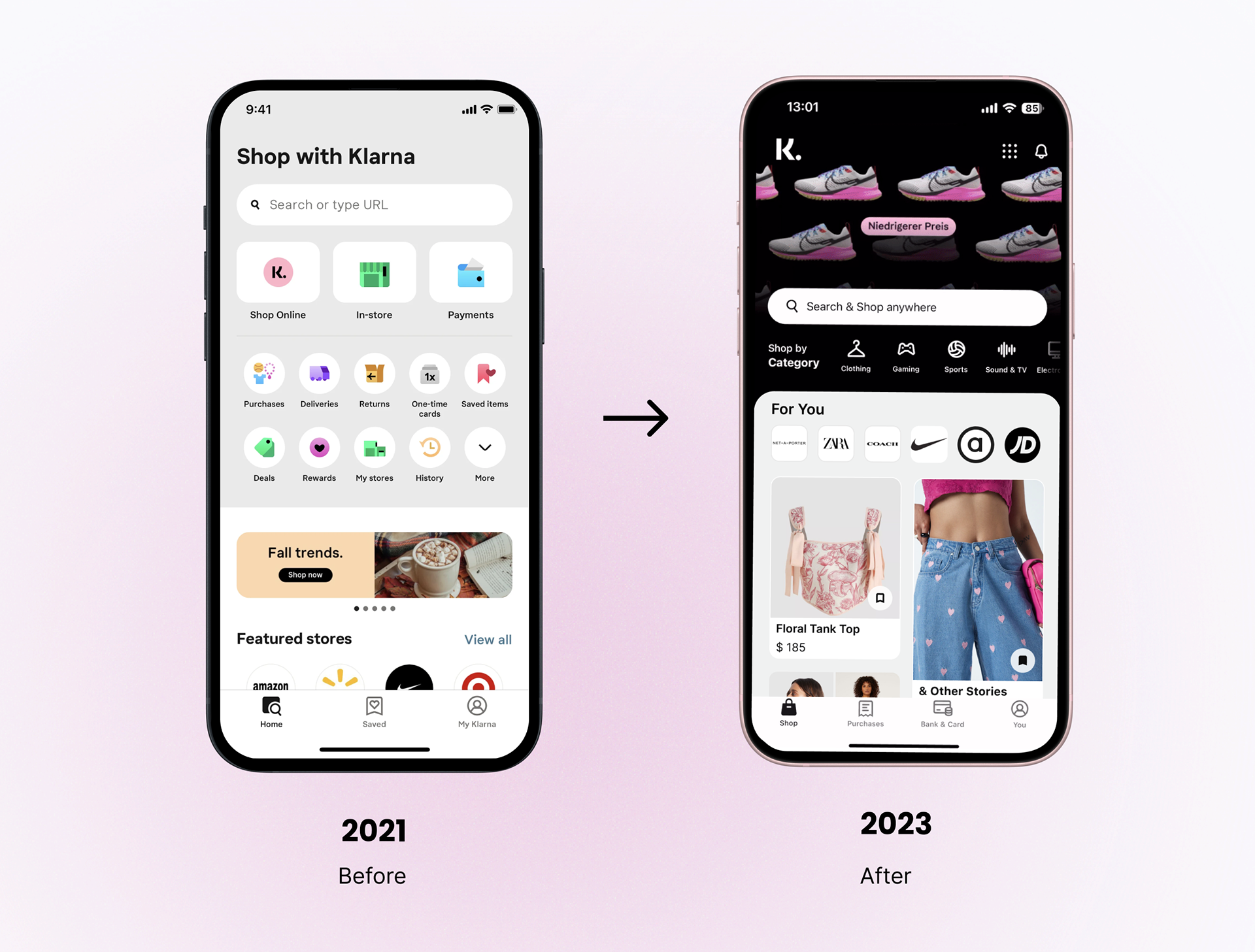
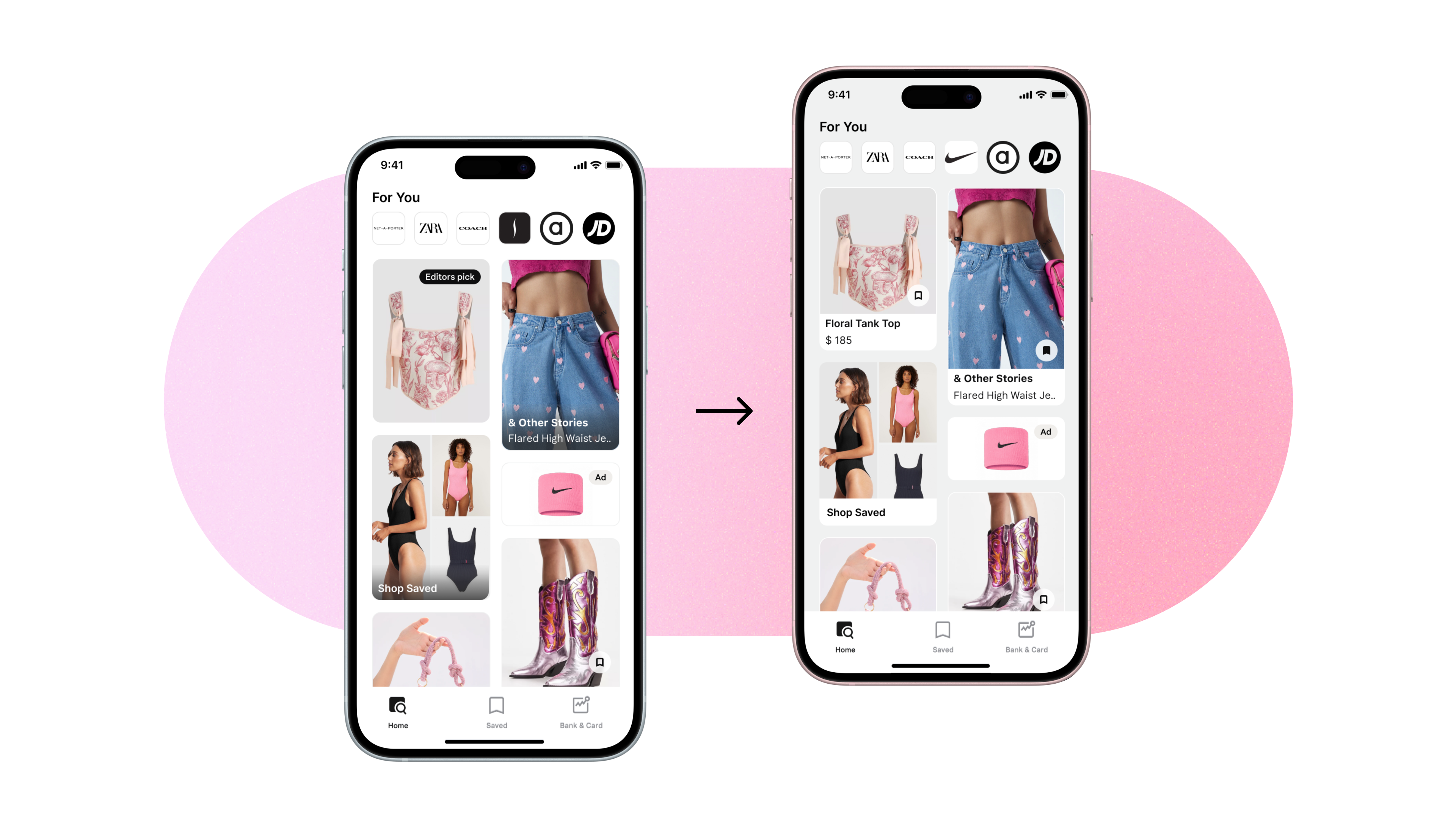
App Home Transformation
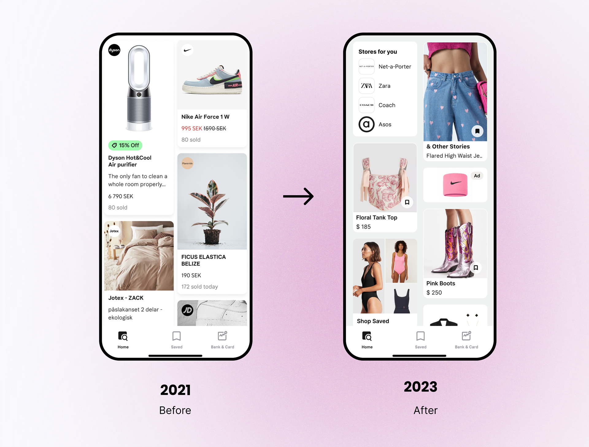
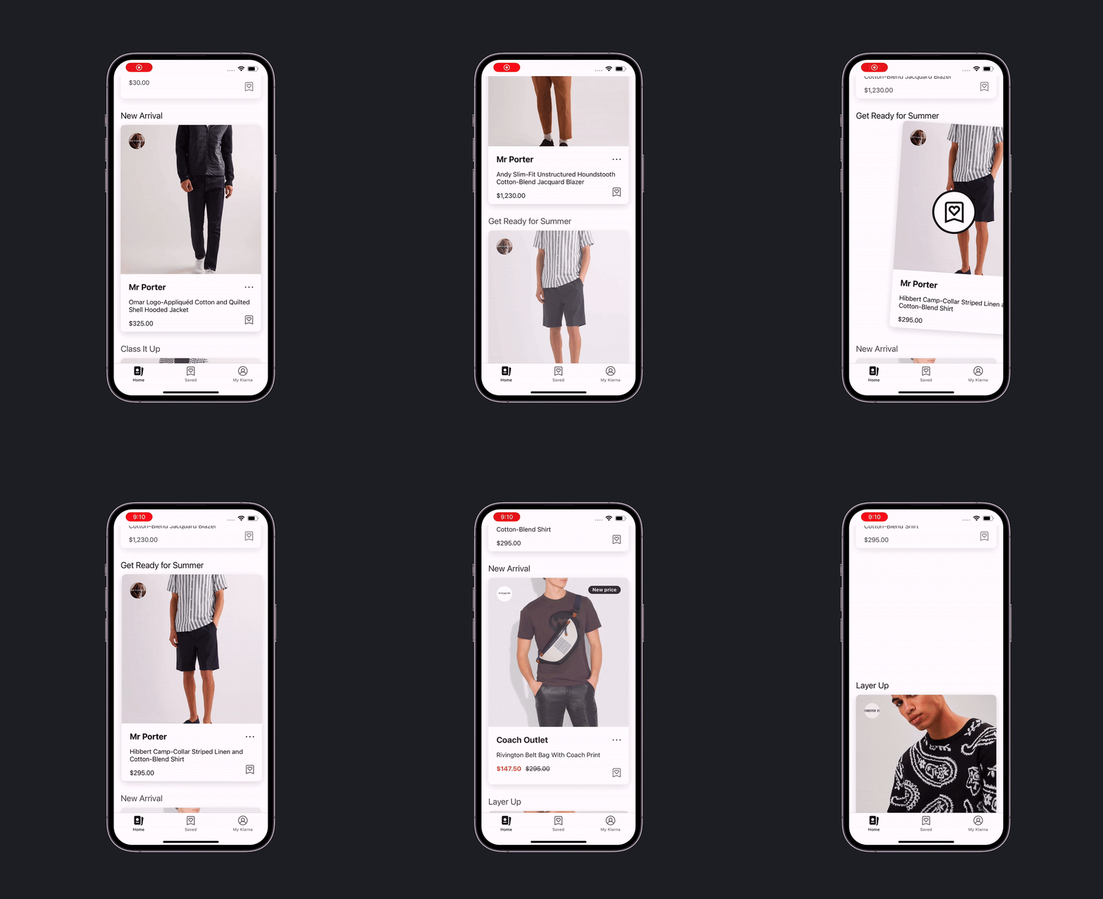
Feed's Content Transformation
Final
Result
News Feed was launched as part of Klarna's 18th birthday product presentation. You can check full stories here
Result
News Feed was launched as part of Klarna's 18th birthday product presentation. You can check full stories here

Shoppable video is also available globally starting October.
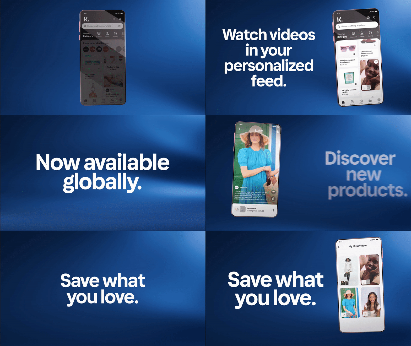
Product Launch Promo Video
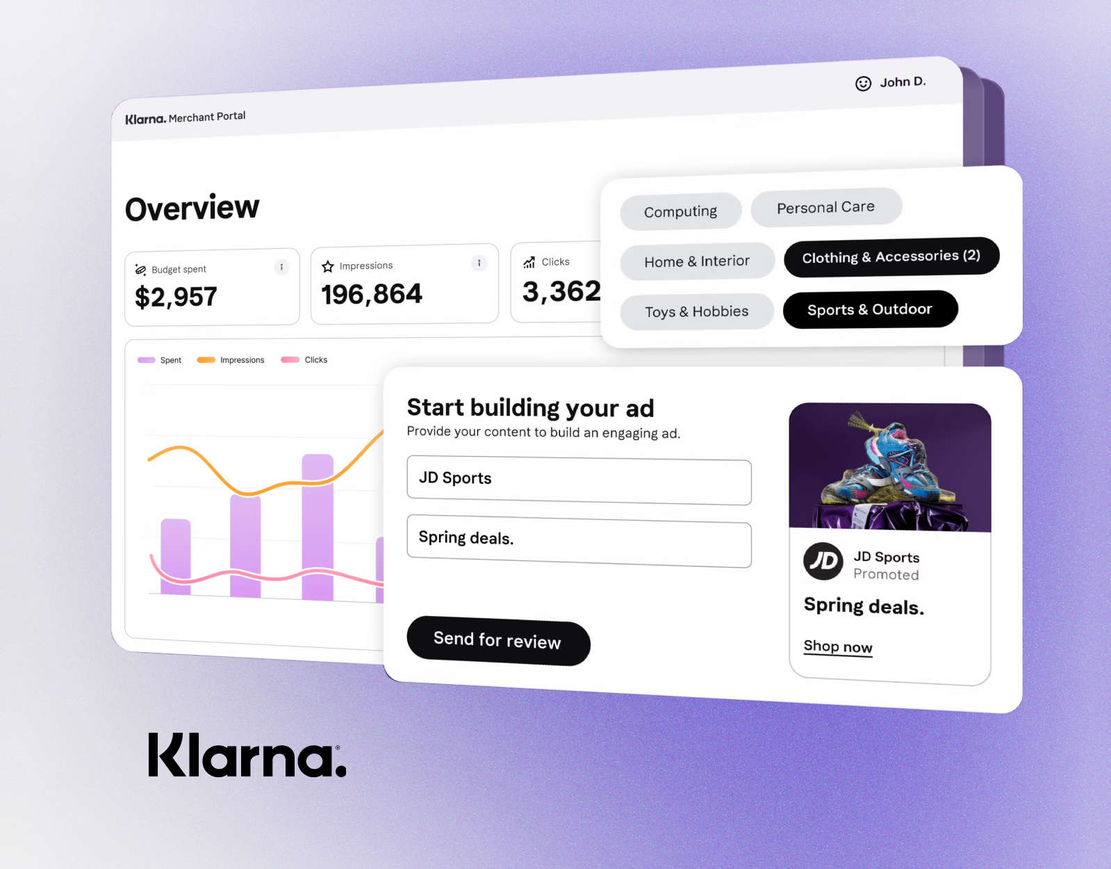
The revamp of the feeds was a significant component of a product update that also introduced new features such as Influencer content and Reselling. Klarna also launched a new product — Ads Manager, which I had the opportunity to work on during the initial discovery phase. You can find more information about this project by clicking HERE.
7.
LESSONS
LEARNED
LEARNED
Place for
Improvement
Looking back, I see that we may start testing earlier and for smaller pieces. Another thing for which I haven't had enough time but surely want to dig deeper is categories. This is an easy and helpful tool to improve personalization and user experience. Improvement
Final
CONCLUSION
The feed redesign became the foundation Klarna built on for its next wave of commerce features, including the Ads Manager platform I later helped shape in its earliest discovery phase.
CONCLUSION
The feed redesign became the foundation Klarna built on for its next wave of commerce features, including the Ads Manager platform I later helped shape in its earliest discovery phase.