DELOITTE
“Intela” Enterprise AI Tax Platform.
“Intela” Enterprise AI Tax Platform.
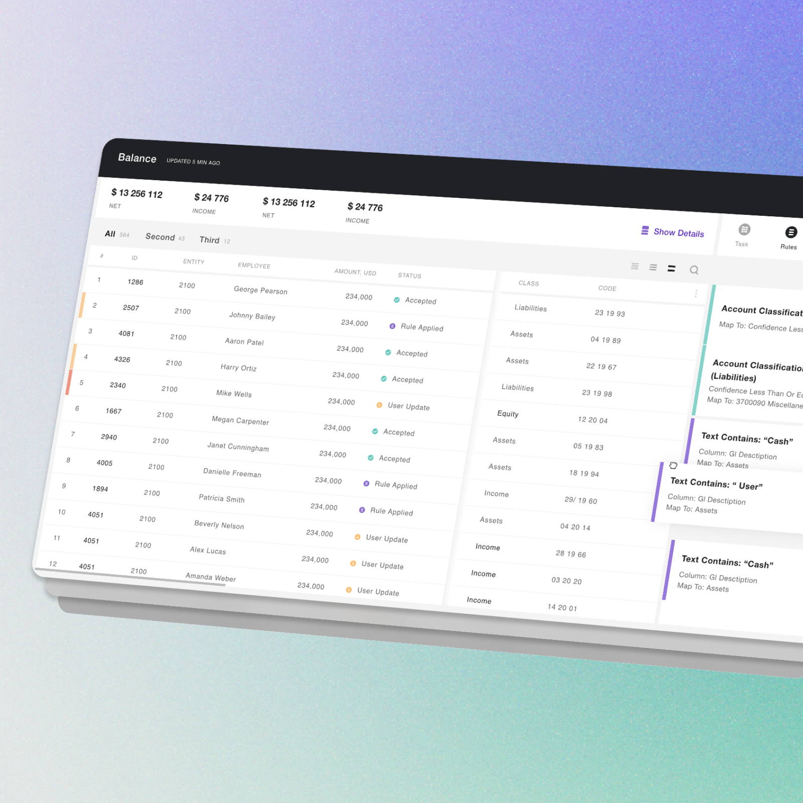
0→1. How I designed complex data-wrangling workflows for non-technical tax professionals — making ML-powered processing feel approachable across global enterprise teams.
Problem
There is a significant amount of manual data entry, analysis, and compliance required with tax-related tasks and processes. By automating and streamlining various tax processes, reducing error risk, improving efficiency, and ultimately improving the overall tax processing experience, the product aimed to address these challenges.
Goal
The goal is to automate and streamline tax-related processes. In addition to increasing efficiency, accuracy, and productivity in tax processing, the product reduces manual effort and improves tax compliance and reporting capabilities.
The goal is to automate and streamline tax-related processes. In addition to increasing efficiency, accuracy, and productivity in tax processing, the product reduces manual effort and improves tax compliance and reporting capabilities.
Role
Lead UX Designer
Lead UX Designer
Responsibilities
Key responsibilities include conducting user research to understand user needs, creating the information architecture, prototyping, and testing design concepts, collaborating with cross-functional teams, and ensuring accessibility and compliance.
Key responsibilities include conducting user research to understand user needs, creating the information architecture, prototyping, and testing design concepts, collaborating with cross-functional teams, and ensuring accessibility and compliance.
Background
I was in charge of Data Wrangling, which is cleaning and transforming raw, messy data into a more structured and usable format for analysis. Correcting errors, removing duplicates, filling in missing values, and transforming data into analysis-friendly formats.
Challenge
Challenge
The complexity of ML, Remote alignment with teams in different time zones, not established design processes, and lack of design system.
Team
Work in a team of 10 designers, leading 3 of them, and support multiple development squads.
Timeline
2019 - 2020
Design
Process
Process
Initial process: Requirements via conference call → High fidelity mockups → Prototype → Call with business feedback session → Final mockups
Transformed into: Requirements in a written task → Research → Low fidelity prototype → Business feedback session → High fidelity mockups → Prototype → User testing → Final mockups → UI implementation validation
Information
Request
Request
I led the development of Info Request functionality that involves sending requests for information to relevant stakeholders, tracking and following up on responses, and integrating the received information into the platform to ensure accurate tax reporting and compliance. The platform also provides collaboration tools and automated reminders to facilitate timely and efficient information gathering.
Data
Preparation
Preparation
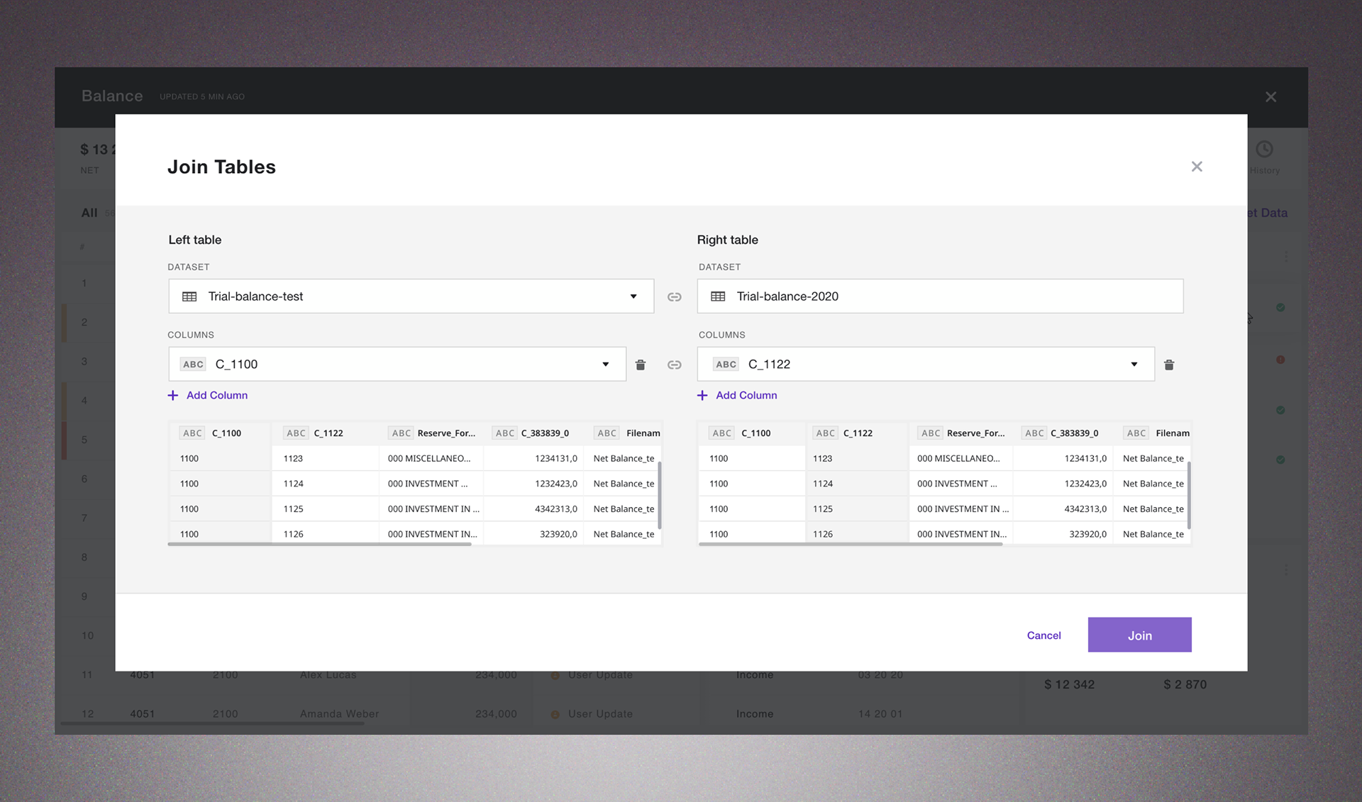
Working on Data preparation my focus was on creating a user-friendly interface that enables users to seamlessly collect, aggregate, cleanse, and transform their tax and financial data in a few clicks.
I paid special attention to the design of the data visualization and validation features, ensuring that the data is presented in a clear and actionable format that enables users to easily identify any anomalies or errors in the data. I also ensured that the platform is scalable and adaptable to accommodate changes in tax regulations and the evolving needs of users.
Data
Mapping
Mapping
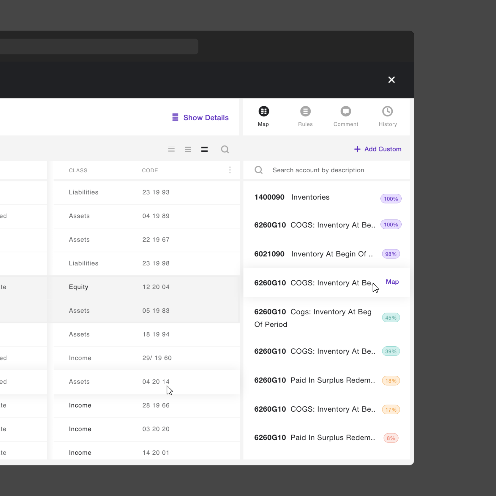
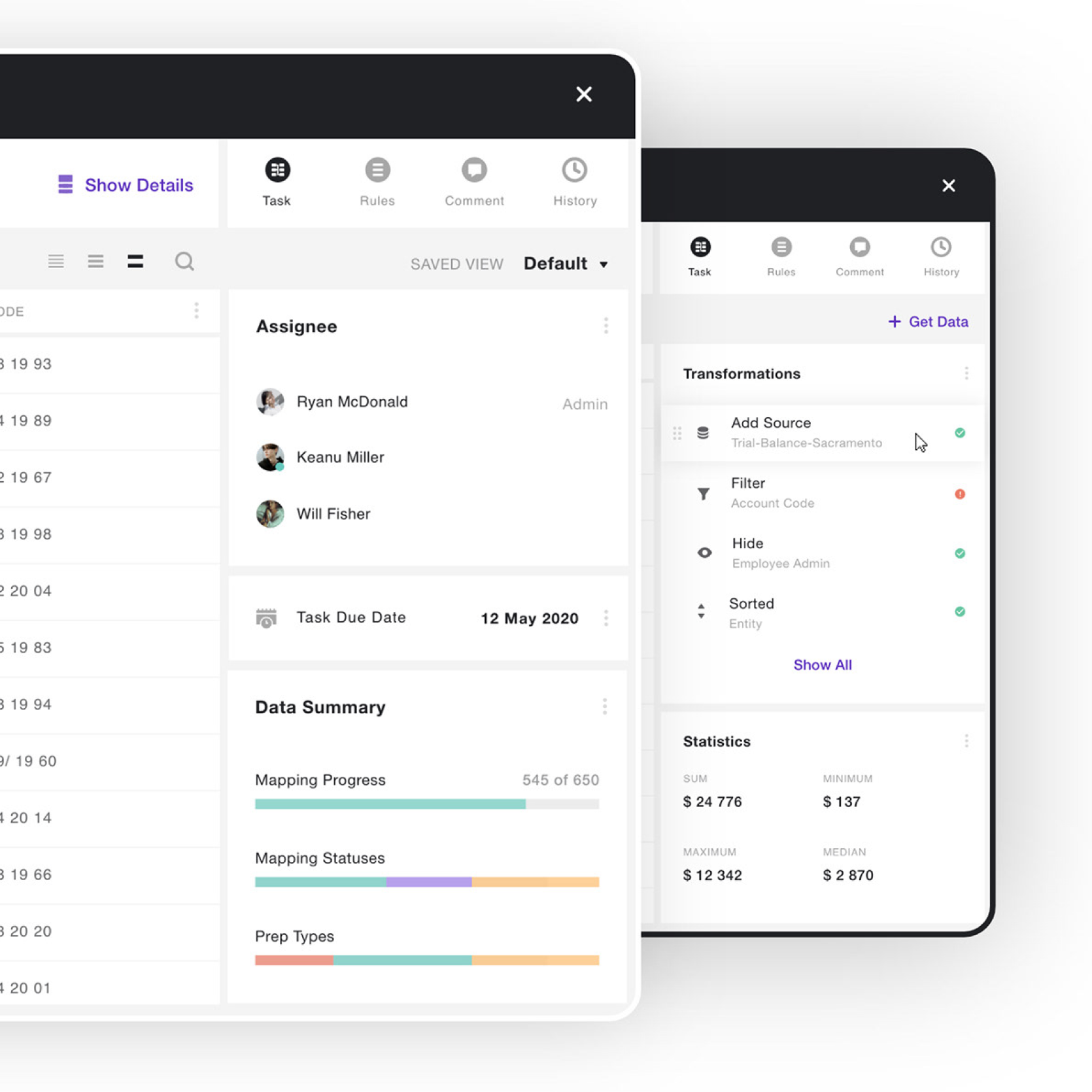
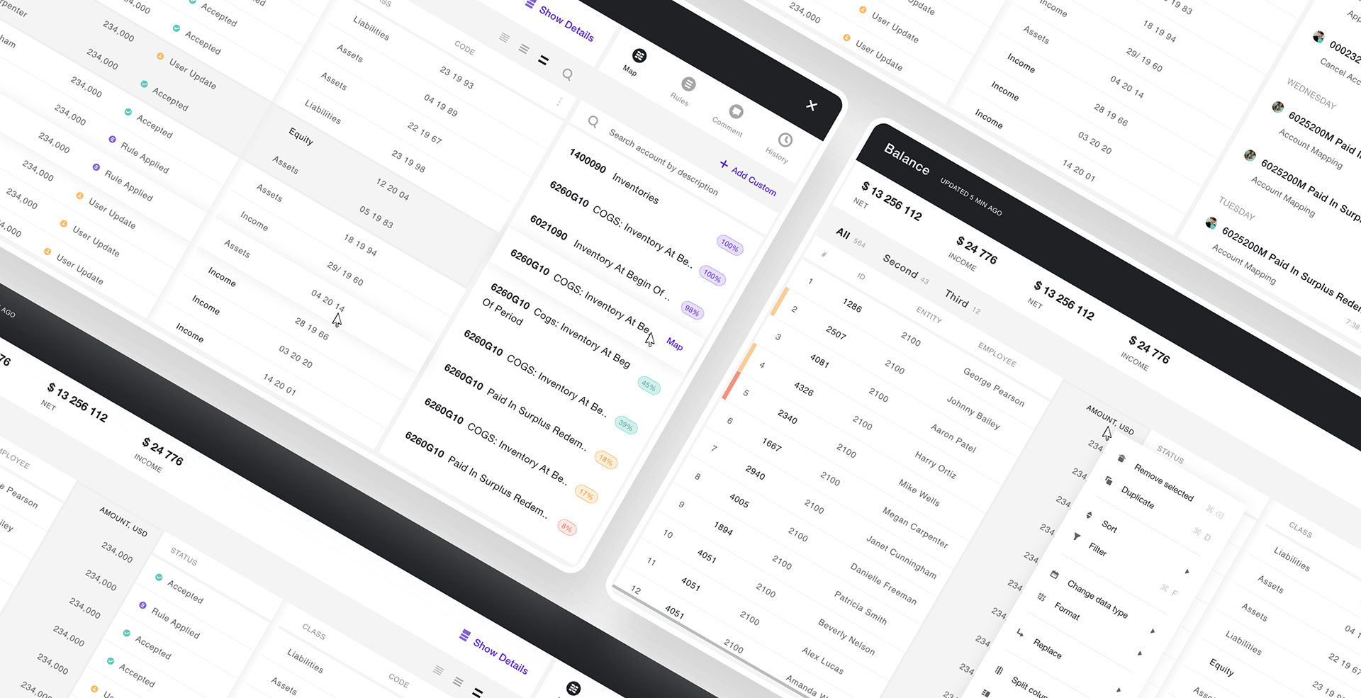
I led the development of a new and improved data wrangling process to enhance the accuracy and reliability of data analysis. I worked on automatically validating the mapped data against predefined rules and providing feedback to the user on any errors or inconsistencies.
I also incorporated features such as drag-and-drop functionality and bulk mapping options to make the data mapping process as efficient and intuitive as possible for users. Overall, my goal was to create a seamless and streamlined data mapping experience that enables users to easily integrate their financial data into the platform for efficient tax reporting and compliance.
Global
Contribution
Contribution
I also initiated adding a setting to change the row height. By using varying row heights, the platform can visually prioritize and emphasize important data, making it easier for users to scan and interpret the information presented in the table.
This is important in a tax management platform where users will be working with large amounts of financial and tax data and need to quickly identify anomalies or errors in the data. The use of different row heights also improves the overall visual appeal of the platform, making it more engaging and easier to use.
Design System
Improvements
Improvements
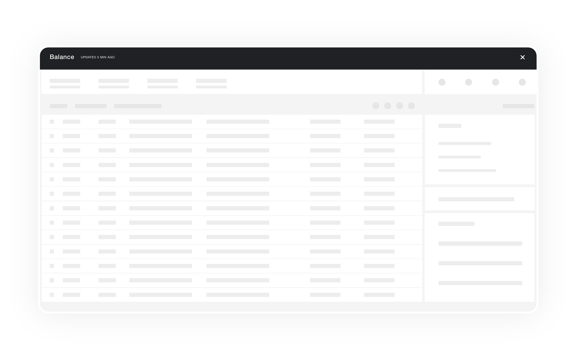
The previous style guide only had a spinner loader, I recognized that this didn't meet the user's needs. I proposed the use of a skeleton loader, which was then implemented system-wide.
This replacement significantly improved the user experience by providing users with a more informative and visually appealing loading indicator. It not only improves the perception of speed, but it also helps reduce user anxiety and uncertainty during the loading process. This is particularly important in a tax management platform where users may be working with large datasets and complex calculations that can take a significant amount of time to process.
Contextual
Menu
Menu
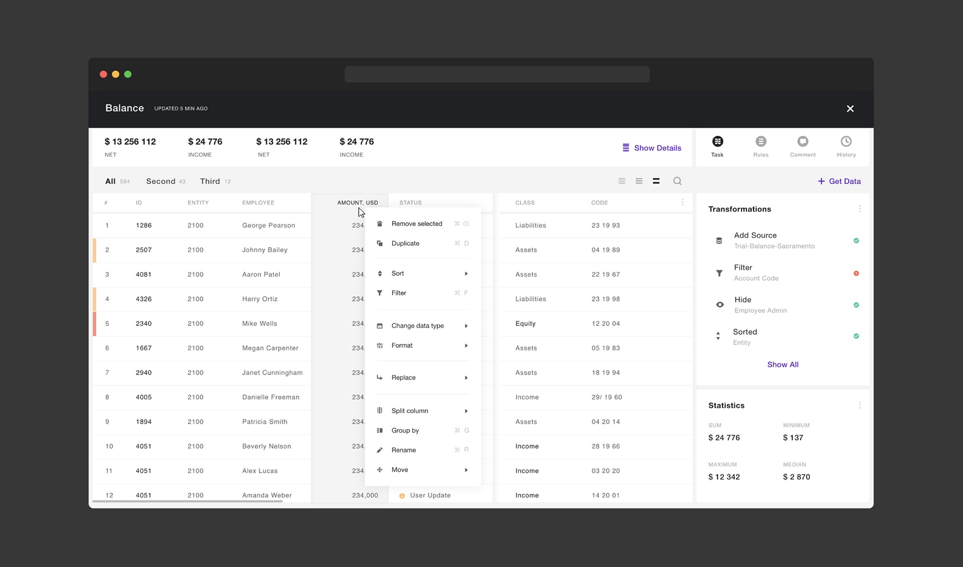
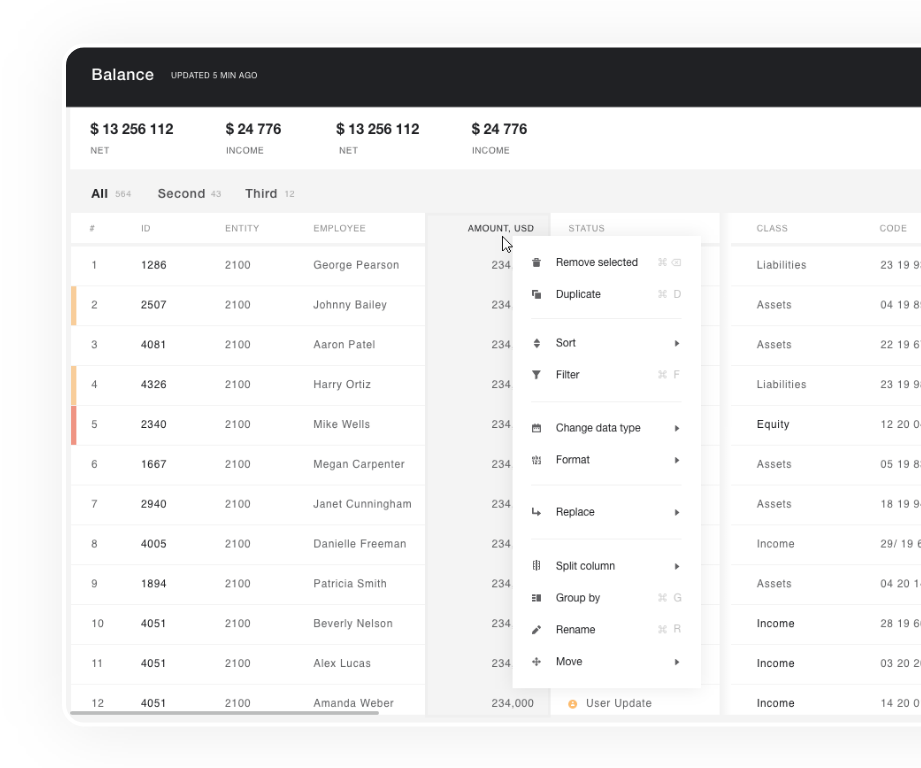
I added a contextual menu to the platform to enhance the user experience and improve efficiency when mapping financial data.
The contextual menu provides users with quick access to frequently used mapping options, such as copy, paste, delete, and rename, without the need to navigate through multiple screens or menus.
By providing these options in a convenient and easily accessible location, users can perform mapping tasks more efficiently, reducing the time and effort required to complete the mapping process.
Additionally, the contextual menu can be customized to display only the mapping options that are relevant to the user's specific mapping needs, further enhancing the platform's usability and flexibility.
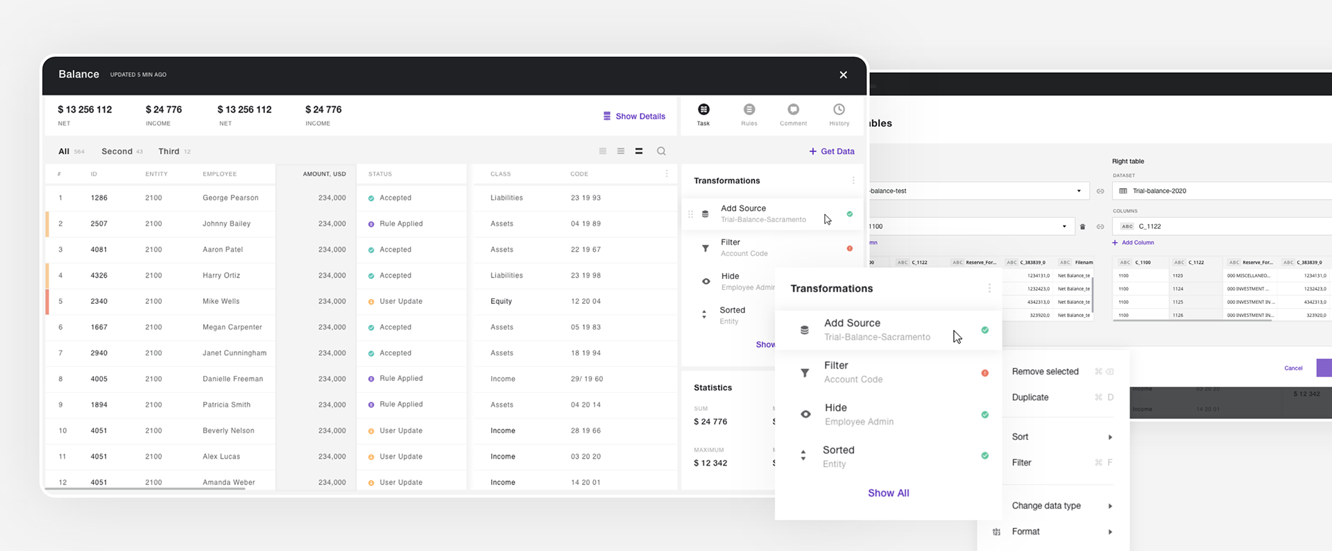
Working on Data Wrangling my focus was on creating a user-friendly interface that enables users to seamlessly collect, aggregate, cleanse, and transform their tax and financial data in a few clicks.
Rules
and Tasks
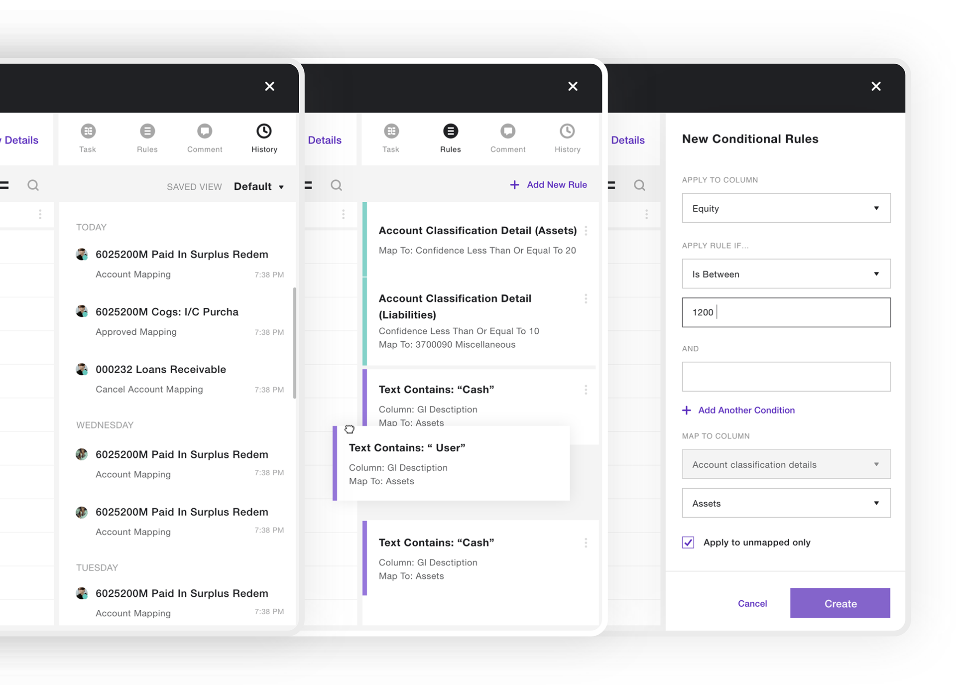
I was working on functionality that allows users to create custom tasks and rules to automate and streamline their tax reporting and compliance processes.
Tasks can be assigned to specific users or groups and can be configured to trigger automatically based on specific conditions or events.
Rules, on the other hand, can be used to define specific actions that should be taken when certain conditions are met, such as notifying users of errors or anomalies in the data or triggering specific workflows.
and Tasks
I was working on functionality that allows users to create custom tasks and rules to automate and streamline their tax reporting and compliance processes.
Tasks can be assigned to specific users or groups and can be configured to trigger automatically based on specific conditions or events.
Rules, on the other hand, can be used to define specific actions that should be taken when certain conditions are met, such as notifying users of errors or anomalies in the data or triggering specific workflows.
By creating custom tasks and rules, users can improve the efficiency and accuracy of their tax reporting and compliance processes, reducing the risk of errors and ensuring compliance with applicable tax regulations.
Name
Validation
Validation
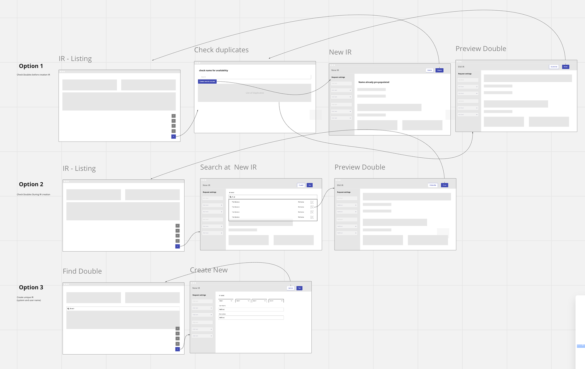
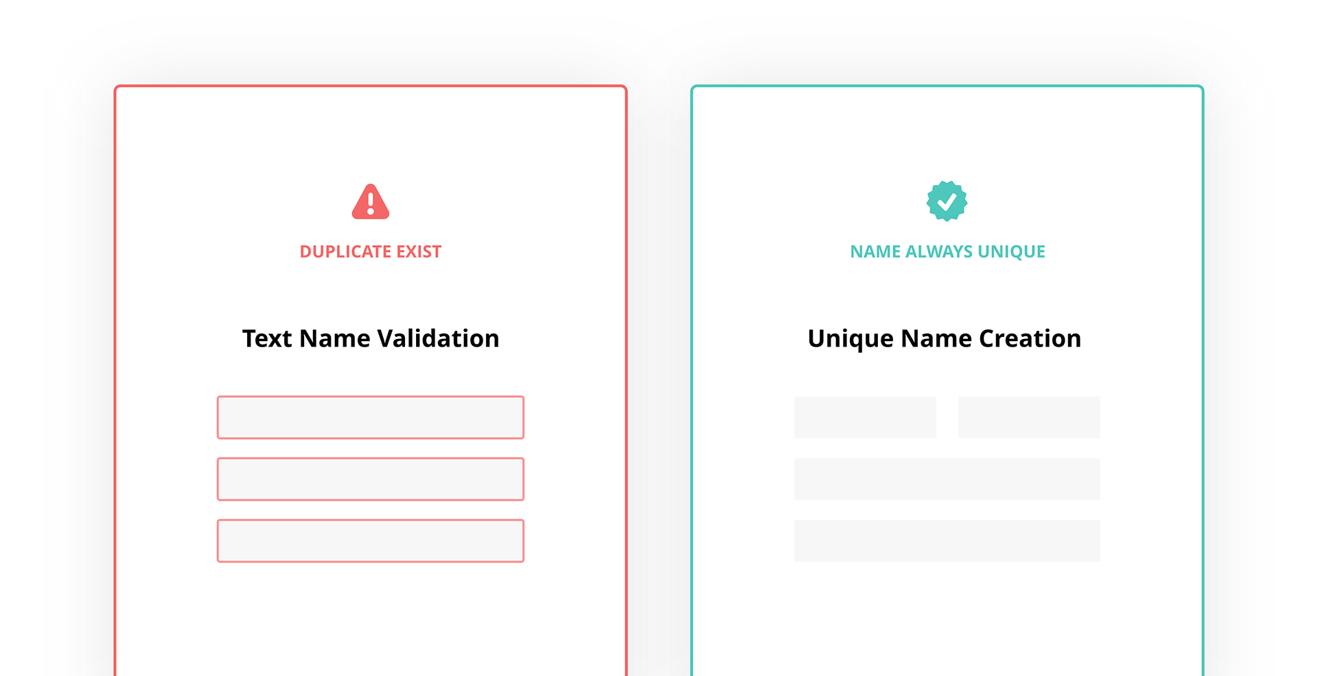
Resolving Duplicates in Key Item List: A Design Solution
I tackled the issue of duplicates in the key item list by researching the root cause. I discovered that the current method of validating the items by name was leading to the creation of duplicates and causing frustration and time waste for the user.
To resolve this, I provided a solution where the user could easily create a unique name, eliminating the issue of duplicates completely.
Data wrangling
Single Screen Concept
Single Screen Concept
At the start of the development, we had a requirement for two different tasks – Data Preparation and Data Mapping. But then I found that this task can be done on a single screen. This is because the user is working over the same dataset, just in different orientations.
Summary
As the lead designer for Deloitte's tax management platform, I was responsible for overseeing the design process end-to-end. This involved conducting user research, creating wireframes and prototypes, testing and iterating on designs, and collaborating with developers to ensure the platform was built to specification.
Throughout the process, I worked closely with stakeholders and users to understand their needs and design a platform that is intuitive, efficient, and visually appealing. The platform features a variety of tools and features, including auto-mapping, bulk mapping, custom mapping templates, contextual menus, and drag-and-drop functionality, that speed up the mapping process and improve user efficiency.
Overall, it was a challenging and rewarding experience that required a deep understanding of both user experience design principles and the complex tax regulations that the platform needed to address.
Overall, it was a challenging and rewarding experience that required a deep understanding of both user experience design principles and the complex tax regulations that the platform needed to address.